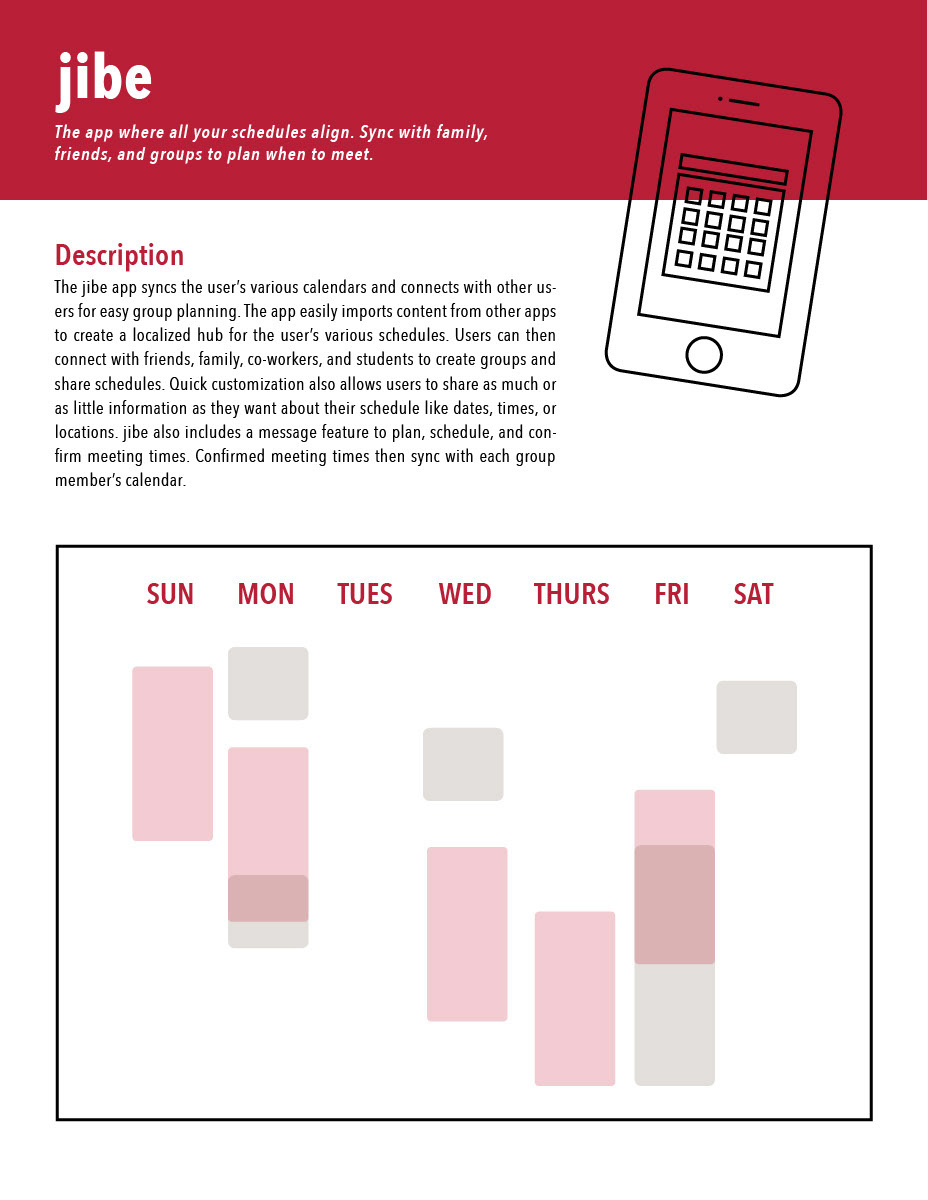
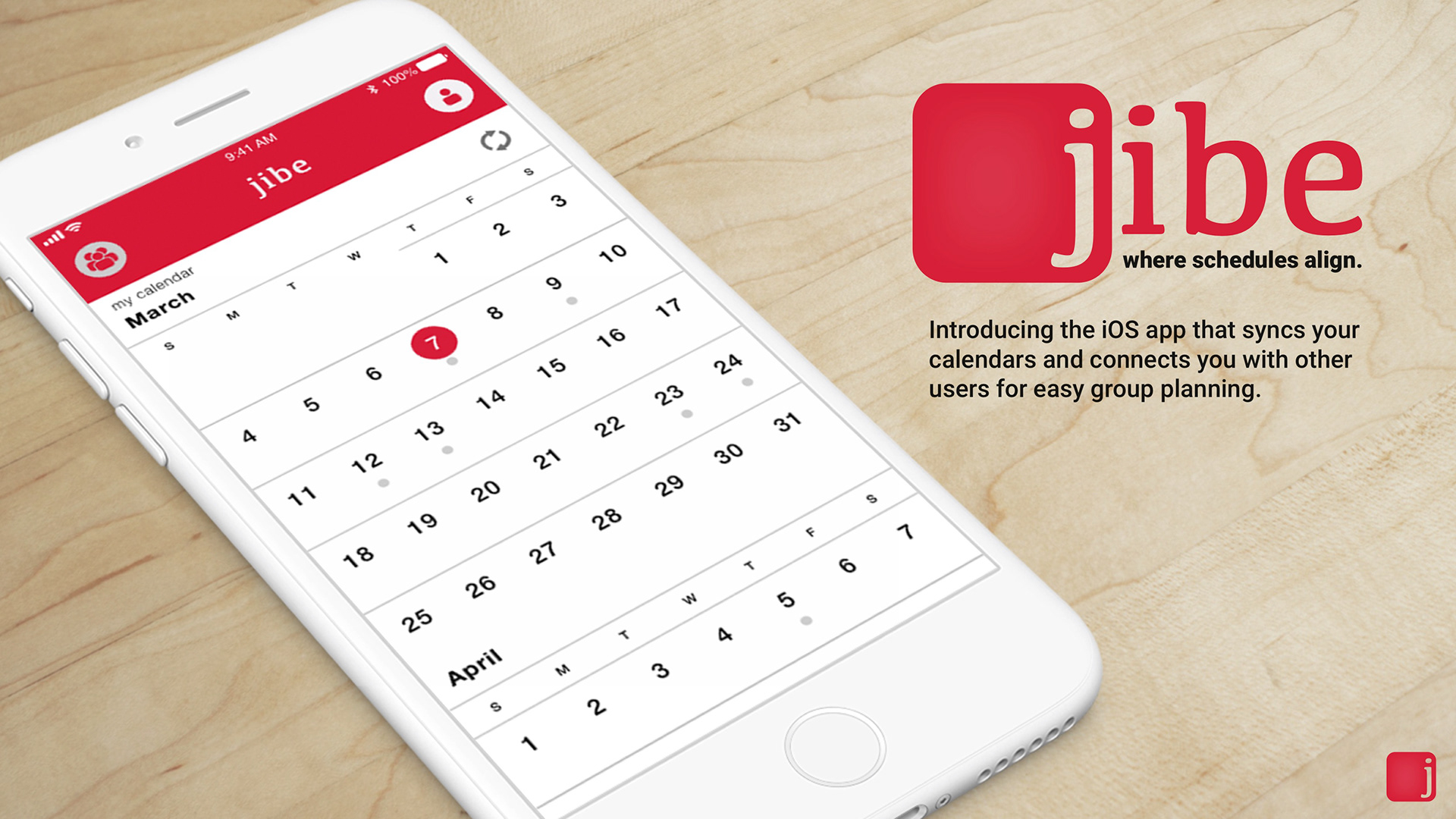
A full-scale user experience and interaction design mockup for a mobile application which enables users to share and sync their schedules for easy group planning.
Identifying User & Targeting Needs
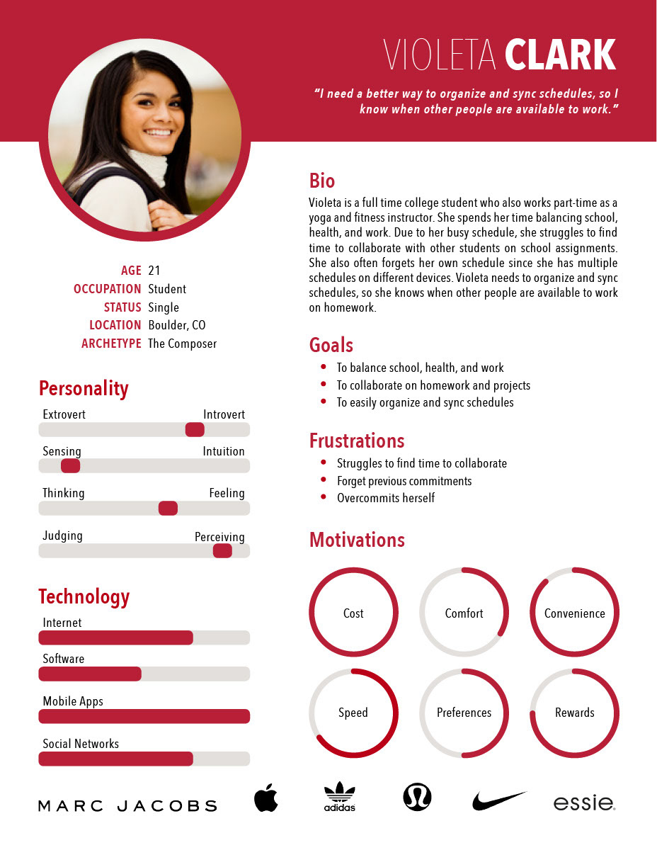
For this project, I was tasked with designing a mobile solution to a real world person's needs. In order to do so, I started by identifying a user and targeting the user's needs. After interviewing friends, family, and strangers, I identified a user and a problem. I noticed many of my friends, family members, and classmates were struggling with scheduling in their day to day lives. While other apps like Google, When2Meet, and Doodle Poll offers some solutions to scheduling, they fall short in offering a complete and synced scheduling solution. Therefore, my mobile app jibe, strives to target these pain points by allowing users a simple solution for syncing calendars and scheduling meetings.
Journey Map
Once I had identified a user, I created a journey map for my intended user. The journey map better depict's my intended user's (Violeta) pain points. My mobile solution then strives to target these pain points.

UI Framework
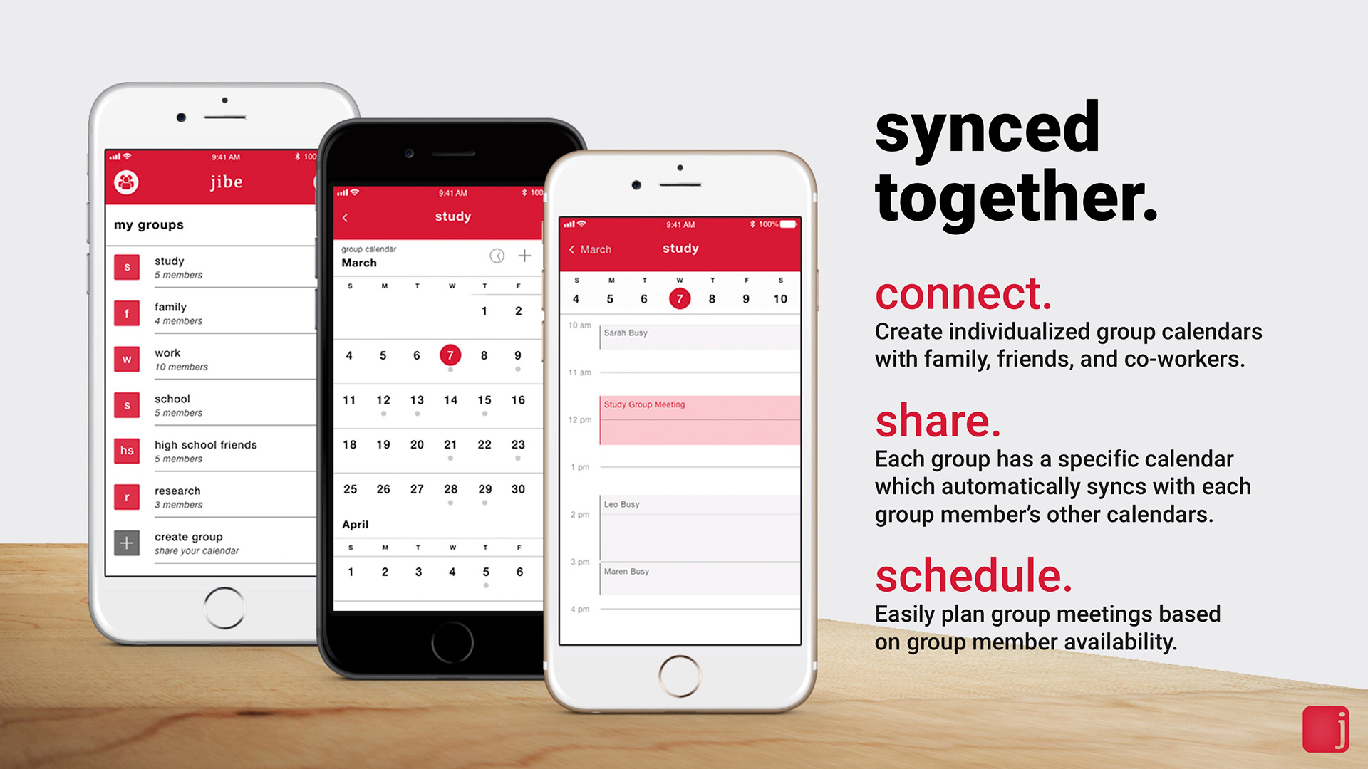
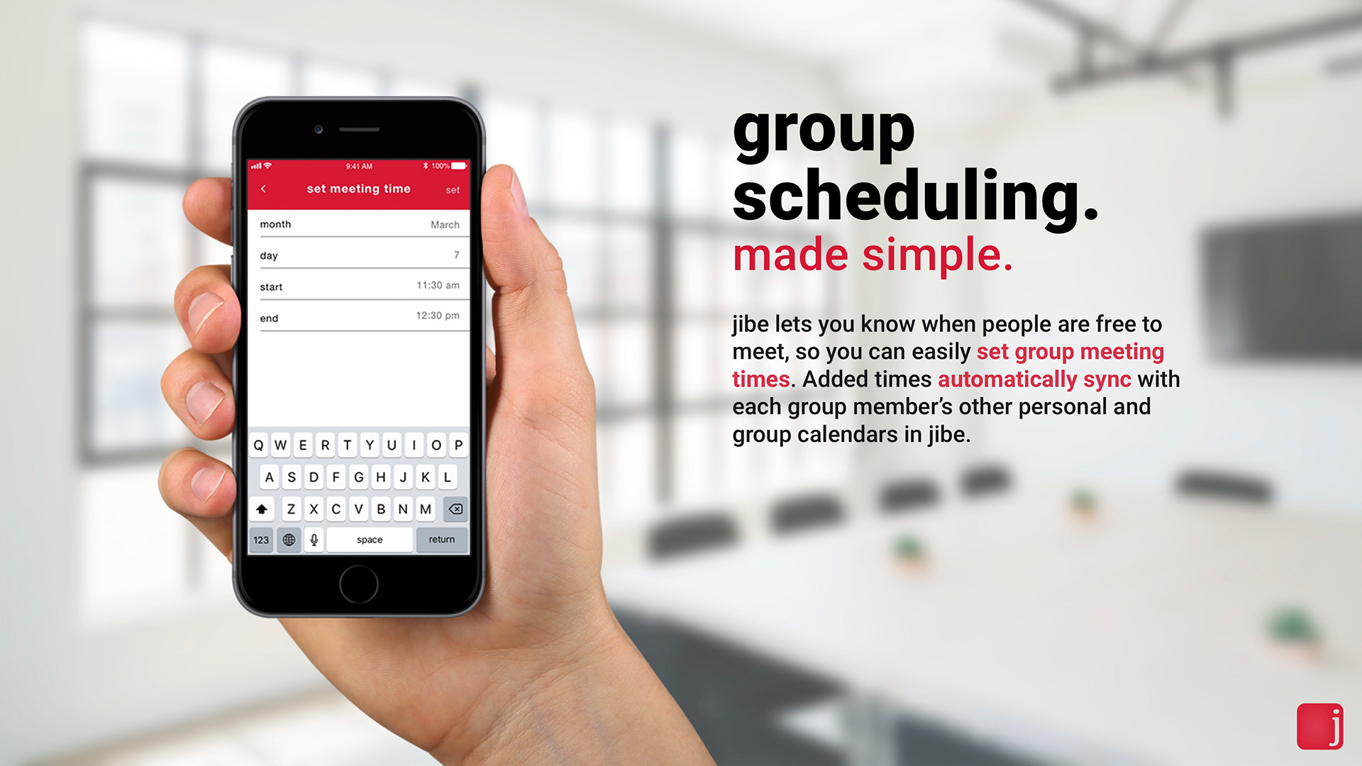
Before prototyping, I created an interaction framework for my mobile solution. In doing so, I was able to see the flow and feel of the app. While this is the final framework, the flow of the app changed throughout user testing. By prototyping the app with users, I was able to identify which functionalities users both wanted and needed. Based on user testing, I learned people liked having both individual and separate group calendars for each group.

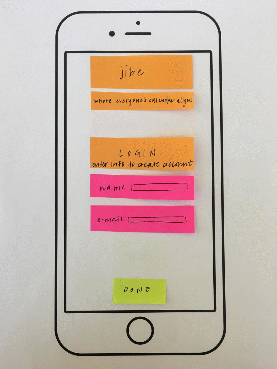
Paper Prototype
While user testing, I created physical, paper prototypes to test the flow and organization of my application. By using sticky notes and paper, I was easily able to adjust the placement and organization of screens, buttons, and labels.
Digital Prototype
Once I had established the needed content through paper prototyping, I created a digital mockup of the app in InVision. I quickly transferred content from the paper prototype to the digital prototype. By doing so, I was able to prototype the mobile solution with users in its intended digital environment. While users liked the flow of my application, I continued to work on the design and feel of the calendar within the app.
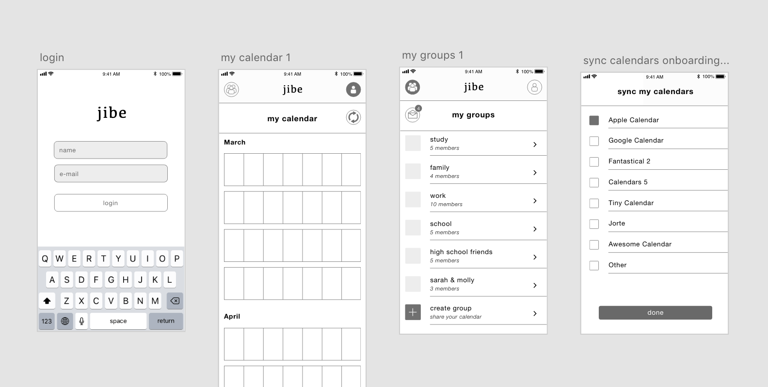
Concept Mockup
Once I had established the flow of the application, I created high-fidelity mock-ups of the screen to showcase the look and feel of the application. In doing so, clients are better able to understand the look and feel alongside the purpose and functionalities of the mobile solution to aligning schedules.
For an in-depth explanation of my ideation process and user experience prototypes of jibe please visit my progress blog.